Designing a community focused mobile application for helping international students stay accountable
Role
Lead Designer
Project
Mobile Application
Team
Product
Timeline
3 Months
overview
Achieving personal goals is difficult because many of us lack meaningful systems in place to hold ourselves accountable to the goals we set. There are many in-market solutions but they provide weak internal motivation, or heavily rely an individual's discipline to help users achieve their goals and build good habits.
It becomes especially challenging for international Chinese students to find support systems that they can use to also hold themselves accountable when balancing opportunities to explore their new environment, stay on top of school work, and take care of their personal lives.
🏆
Investigate how international students are currently establish accountability frameworks
Understand how students currently feel about their market solutions
🚧
Identifying cultural differences or language barriers that should be addressed
Including design elements and information hierarchy that would be familiar for international students
Informed by Cialdini's 6 principals of influence, how can we rethink social media as an accountability tool?
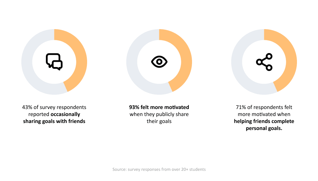
To gain a better understanding of the cultural nuances as well as general factors relating to motivation in students, we conducted interviews with 3 Chinese international students, created user journey maps, and sent out surveys to the general student populace.
These were our findings.
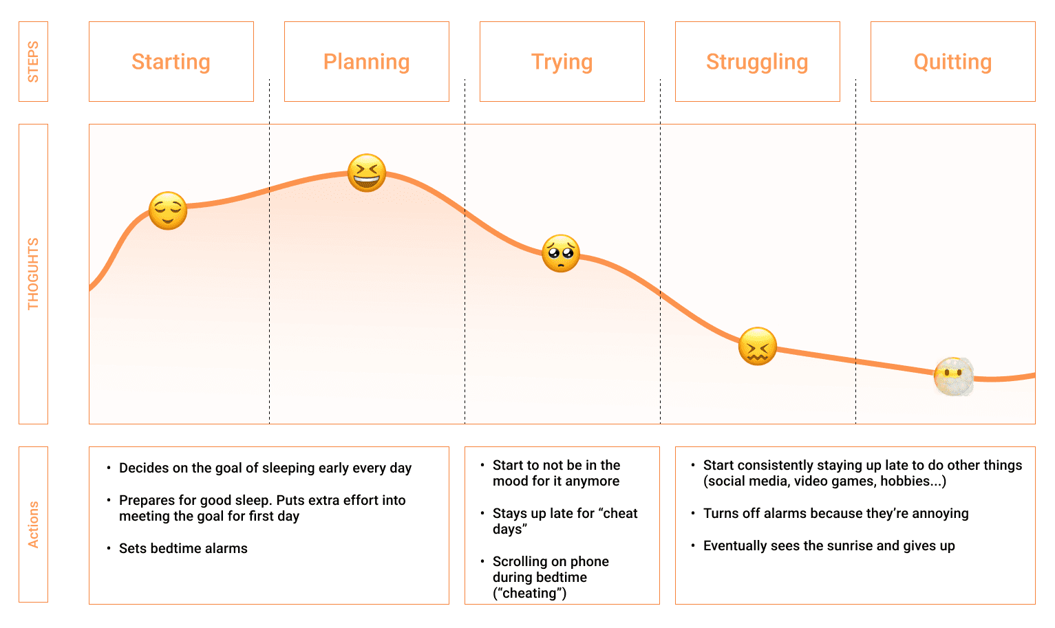
User journey mapping was also used to identify touch points our product could have with users. We agreed that the "trying" stage should be our area of focus, as that is when users begin to lose motivation but could still be convinced to stay committed to the goal.
We hypothesized that by providing users with praise and external validation would make their efforts feel more rewarding, and encourage them to keep trying or try a new strategy. Providing emotional support as well as offering advice when users start to struggle was the reason we wanted to allow other users to interact with each others' posts.
We also conducted competitive analysis on popular to-do list applications available on the market, such as Notion, Google Tasks, and Microsoft To Do to get a better understanding of what gaps exist in the market. We saw that a lot of existing applications lack fleshed out accountability tools and heavily depended on users' internal motivations. These applications were also primarily designed for tracking and completing one-time tasks, rather than encouraging and building habits.

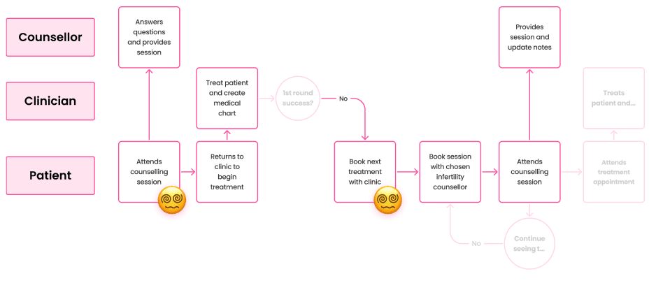
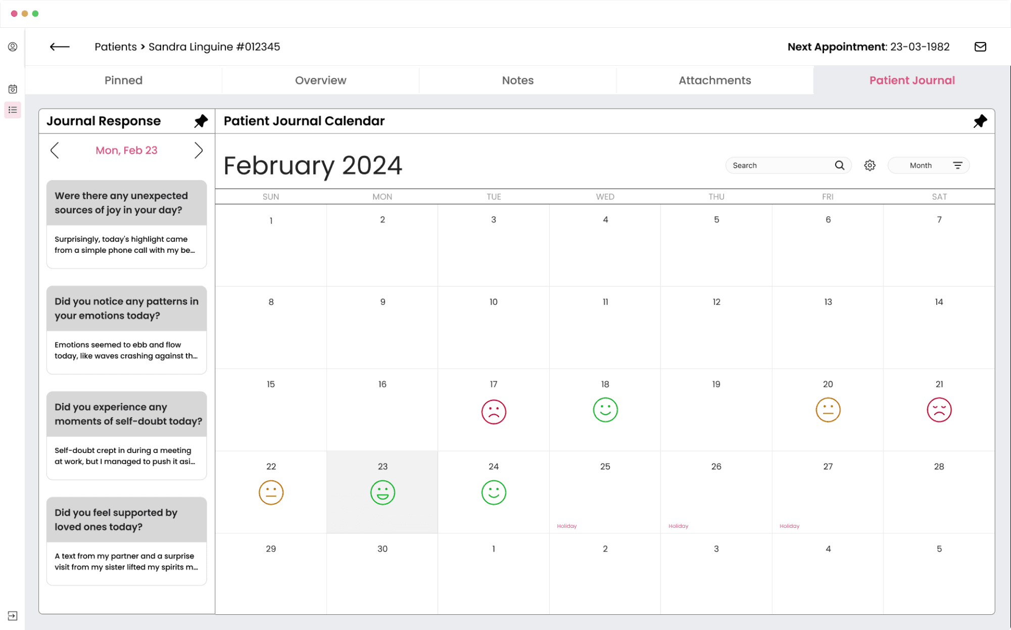
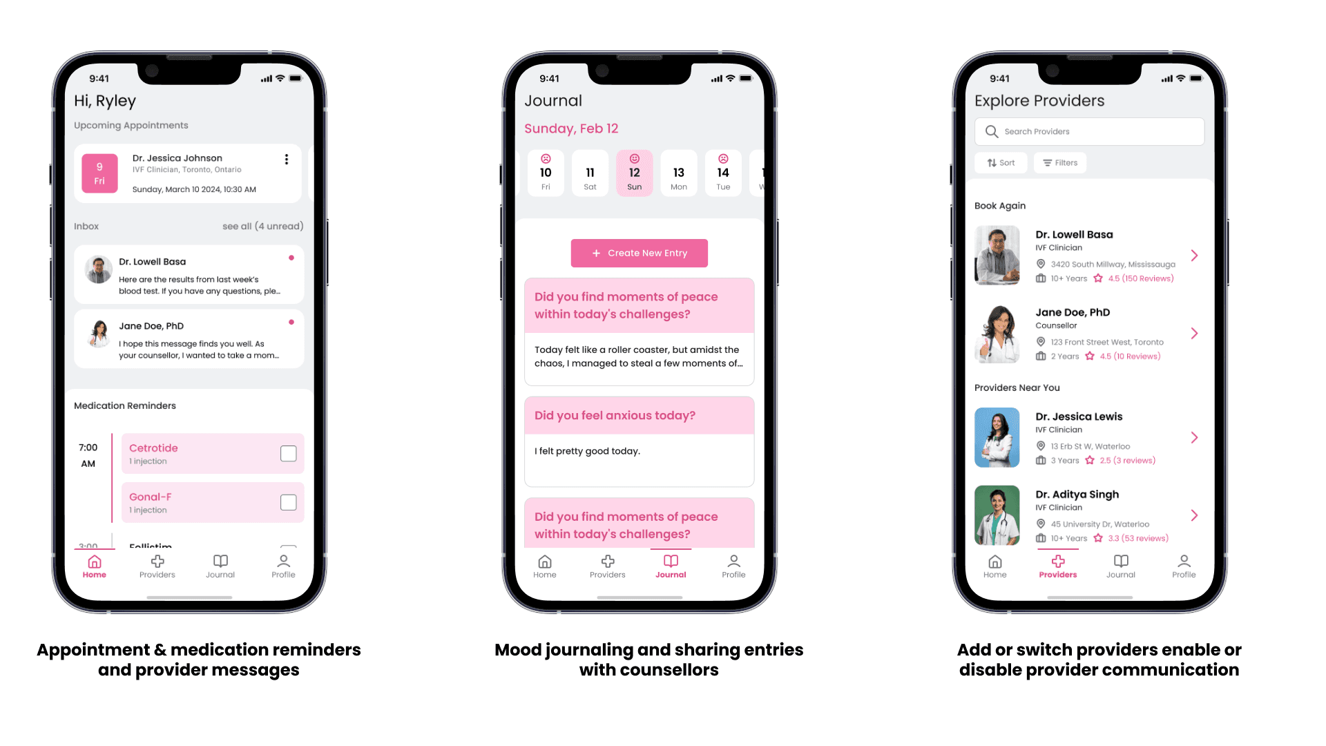
One of the key findings that we were interested to learn more about was the collaboration that happens between psychiatrists and clinicians. Some fertility clinics will have partnered counsellors, but most do not, resulting in patients having to go and find fertility counsellors themselves. Fertility counsellors differ from traditional counsellors in that many of them have undergone treatment and have deeper knowledge of the medical terminology.
Currently, communication between counsellors and clinics outside of partnerships seldom happen as there are no formal channels to regularly facilitate this communication. This results in patients having to take on the additional burden of remembering and relaying information between both parties.
Due to the limited resources available and the duration I was able to work on this, the revamp happened iteratively and key design milestones were set out for me to complete as a part of this revamp. The features were decided through a mix of UX research and business requirements
📖
🧭
💳
📦
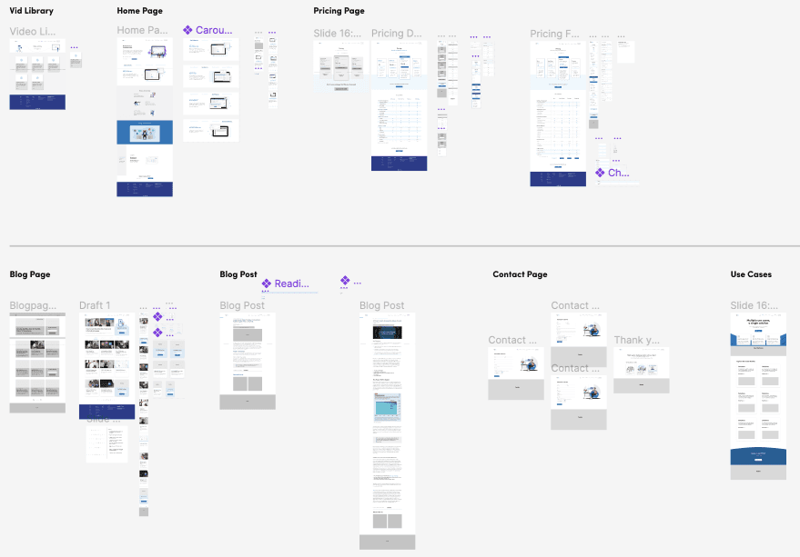
To start our wireframing process, we created rough sketches on user flows, what features we could have, and what features we will not have. We did a lot of explorations around what a to-do list could look like as well as how users could navigate around the app.
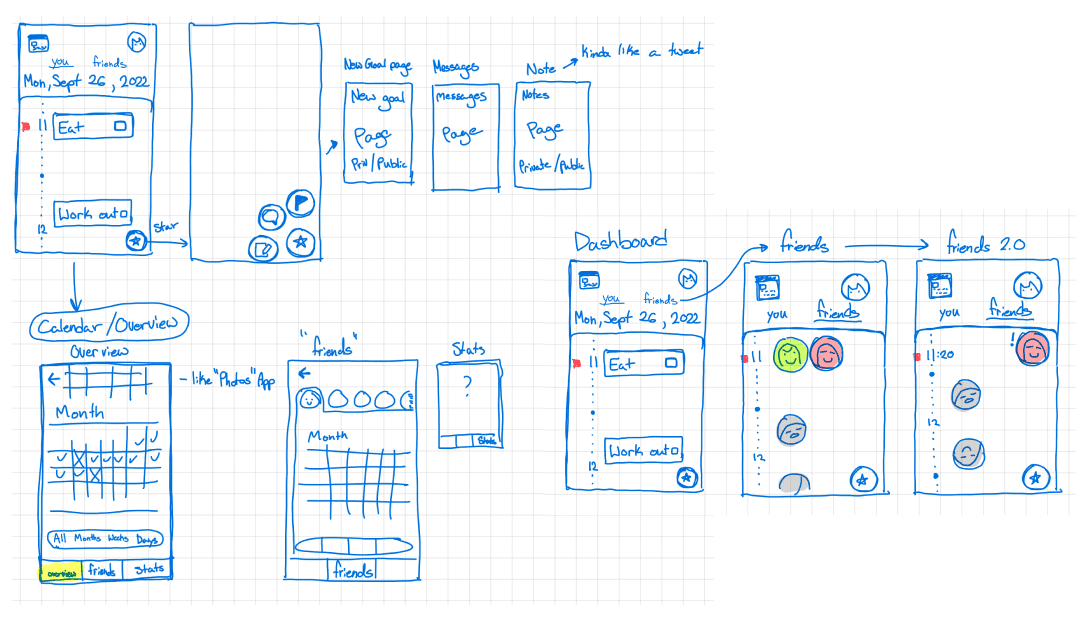
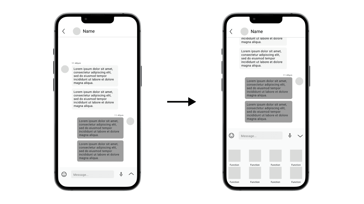
We created several low fidelity wireframes to do early usability testing with users to measure the intuitiveness of our designs and features. Primarily, we wanted to focus on the task setting, nudging, and sharing aspects of our app.
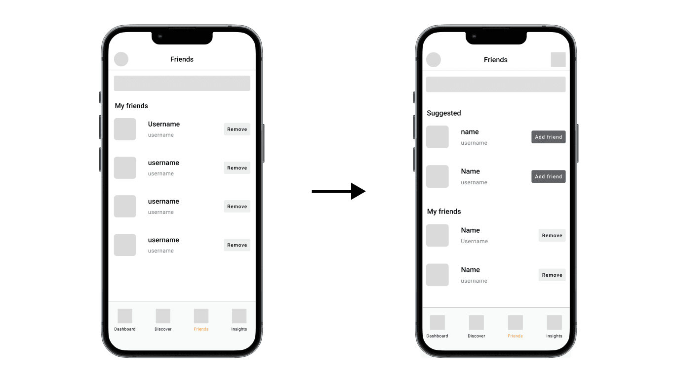
Through conducting early usability testing with 3 Chinese international students with our low-fidelity prototype, we received feedback that resulted in some quality of life changes made to the design to give users a more seamless experience. One of these changes includes adding a suggested users section so that friends can find mutual friends easily without exposing our users to public searches.
Additional keyboard functions was something we noticed with WeChat, allowing users to send each other stickers, call, share location, documents, and even sending money to each other. We wanted to implement something similar so that users have wide freedom to express themselves.
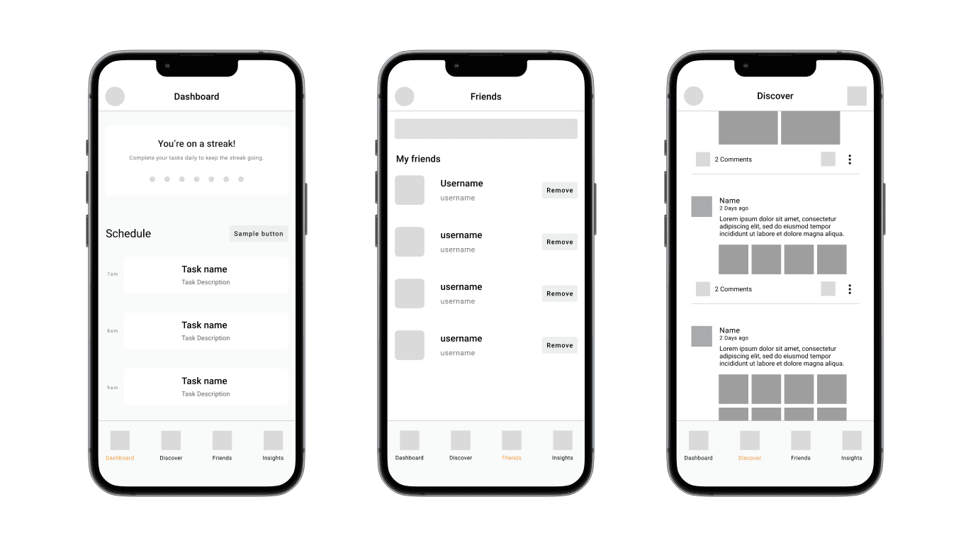
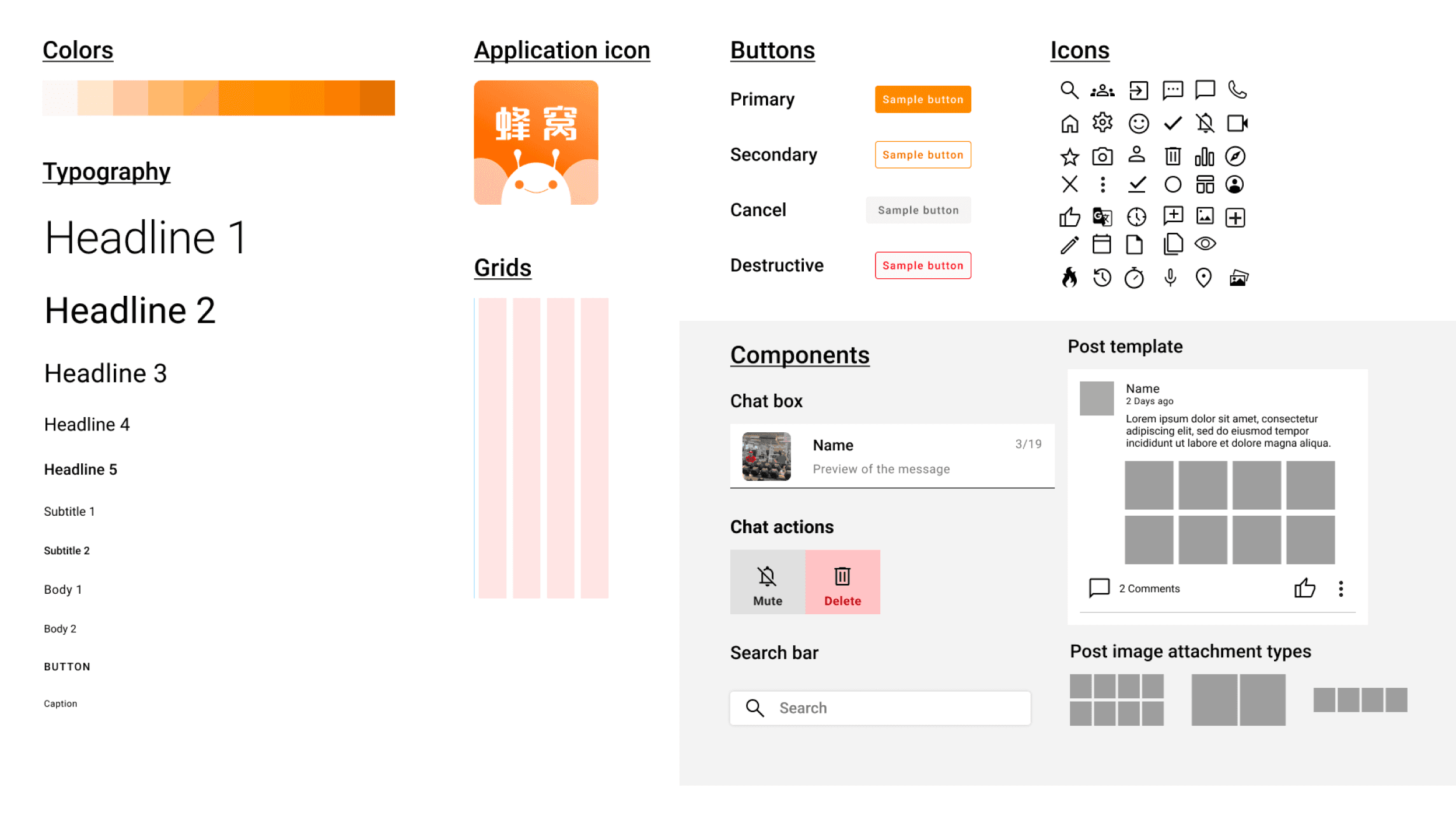
An extensive design system was built to support scalable design in our solution. An emphasis was put on designing components that could accommodate lists of items of 0 to infinite. This is especially important in features such as our discovery, friends list, and chat functionality.
Google's Material Design system was referenced to ensure our app meets accessibility requirements in our typography, colour, and element sizing choices.
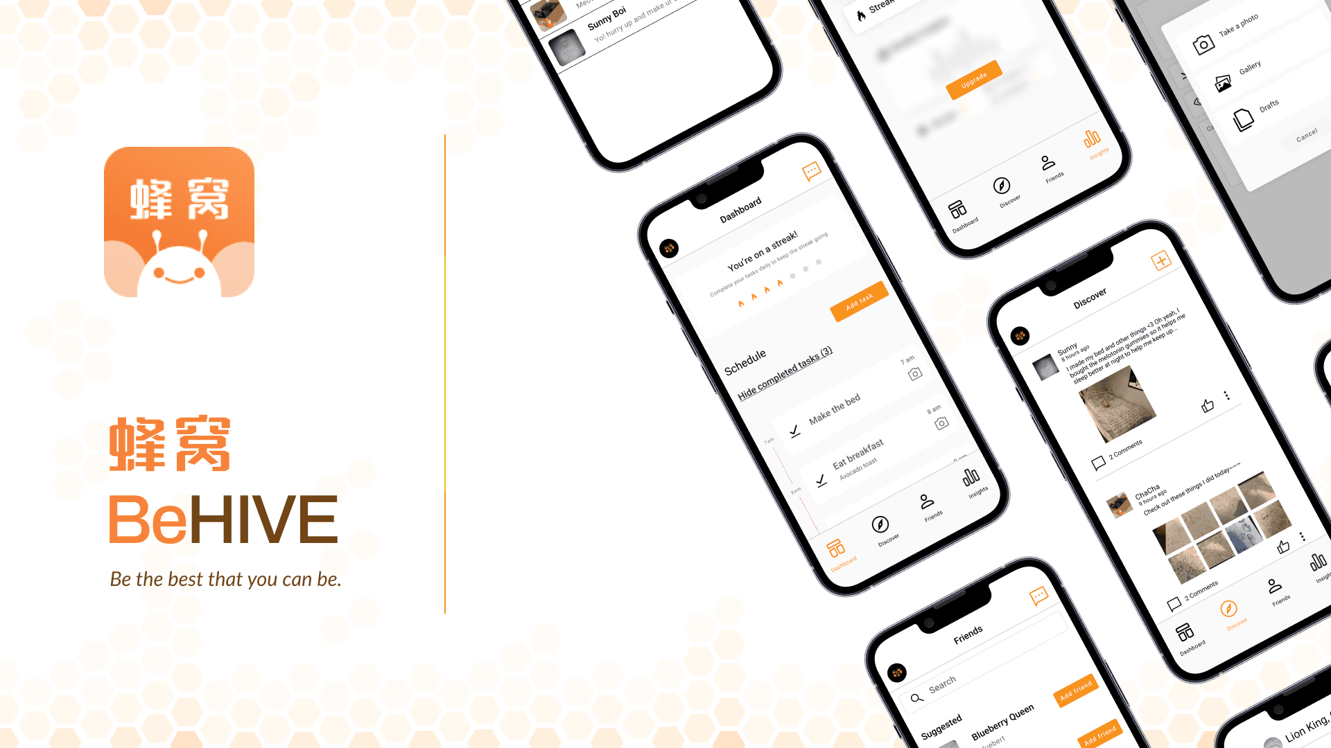
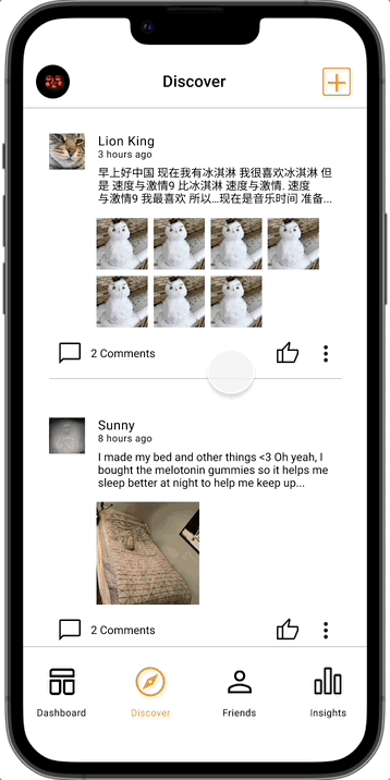
The goal of BeHIVE is to turn friends into a system for helping individuals build good routines and achieve self-success. We thought about ways in which users may abuse the system and looked towards social media applications for inspiration on how to protect user privacy, as well as promote authenticity of posts.
Our product is based around the basic core functions of a to do list (add task, mark as complete) and some core features of social media adds (groupchats, posting, and friends). We also took inspiration from the roster of applications most commonly used by Chinese international students; Instagram, WeChat, iMessage, and Bilibili.
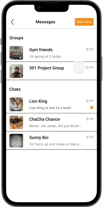
We have also taken into consideration safety features, such as reporting posts, blocking users, and visibility controls for more intimate tasks. Profiles are also not randomly available for others to browse, and a unique username must be searched for the account to show up to send friend requests to. This is to protect the users' privacy and protect them from strangers and malicious actors.
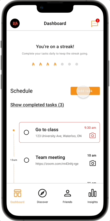
By adjusting sharing permissions, friends can see tasks that users were supposed to be completing, but may have potentially forgotten about. This feature is further empowered through our accountability group chats, where multiple people within a group can send reminders for forgotten tasks with group visibility settings.
Users have the option to upload photos when completing a goal to share with friends. The posts disappear after 24 hours, designed to disincentivize creating fake posts to farm post statistics and cheating to create content. Users can interact with posts through commenting and liking, as well as through messages when posts are made. We want to help users enjoy and celebrate the small wins in life with their friends.
In order to gain actionable insights from our research, we decided to conduct thematic analysis on the feedback we received and plotted to-do items along axis of ease of implementation and importance to MVP. Our clinic and counsellor partners provided an abundance of suggestions, but because of the timeline we were provided it would be impossible to implement them all.

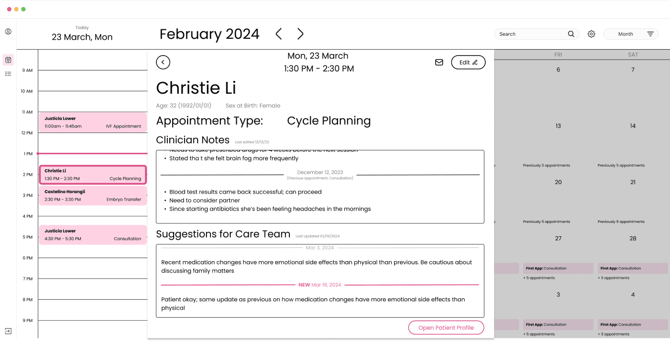
Through discussions with our providers, we were able to get a better understanding of some of the medical terminology used within EHR software and did our best to provide doctors the information they needed at a glance without compromising on layout and spacing.

Additionally, counsellors get a tab for accessing patient journals where they can quickly browse and identify entries that would be relevant to them. For example, the mood indicators and shared prompts would help counsellors find days that patients may want to discuss ahead of the appointment.
Lastly, admin staff can access provider calendars, patient information, and contact information in order to manage and make bookings.
Completing this capstone project was an opportunity for my team to demonstrate the skills that they have polished up over the years and to build something meaningful together. As the product manager and lead designer, I worked a lot on making sure my team had what they needed to succeed and to challenge my teammates to grow. This experience has taught me a lot about motivating a team, thinking big picture, and building products that excite the user.
💻
👔
🗻
📊
Because of the immense scope and complexity of the project and the very short timeline we were provided to achieve it, there are many things I would update and change if I had more time with it. A major obstacle that we have to fully overcome was our lack of medical background and inability to fully comprehend our competitors' products. I would've loved to spend more time with doctors and register with competitor demos to better understand the ins and outs of the EHR software space. This would help us create a more realistic high-fidelity providers' piece where it would be a much more viable MVP than the version we have now.
Another aspect that we wanted to touch on if we had more time was exploring more workflows for the other roles present in a clinic. These roles include nursing teams, embryologists, admin staff, and substitute doctors and all have specialized functions within a clinic. While we have thought about their touchpoints with the primary doctor, thinking and designing out a more fleshed out work flow would also be an amazing improvement to our current design.
Conclusion
Behind the scenes
⚙️
Figma & FigJam
Adobe CC, Google Suite
❤️
My amazing capstone team
Our Sun Life mentor Samanthi
The Sun Life team for supporting us!