Leveraging storytelling techniques to enhance the navigation experience of Triyo's main site.
Role
UX/UI Designer
Project
Website Redesign
Team
Marketing
Timeline
4 Months
overview
TRIYO is a data intelligence platform that gathers data on the communication activities of individuals in an organization. It turns this data into actionable insights on resource utilization, client engagement, and process efficiencies. I had the opportunity to join them in 2022 as a UX/UI designer for the marketing department, where I worked alongside marketers and developers to spearhead a website overhaul project.
🏆
Understand what kinds of information users were looking for and expecting to find on Triyo's site.
Iteratively implement features to improve scroll through rates.
Redesign the core pages on the site.
🚧
Limited engineering resources - what are the minimal amounts of changes that offer the most impact?
Users are not readily available for interviewing, reliance on subject matter experts for direction.
Synthesizing and deriving insights from metrics gained over short period of time.
How might we improve the scroll through rate of the Triyo site by implementing story telling techniques?
When I first joined TRIYO, an issue that the marketing department was trying to overcome was that website visitors were not interacting with the content. From our Google Analytics, we can see that we had an 80% bounce rate on our landing pages, and visitors on our main site seldom visit other pages to learn more about the product. Why is that?
For this case study, I will discuss the navigation redesign, pricing page redesign, and component design activities that I did as part of my internship. There were many other projects involved in the revamp that were made, but were incomplete due to the timeline I had.
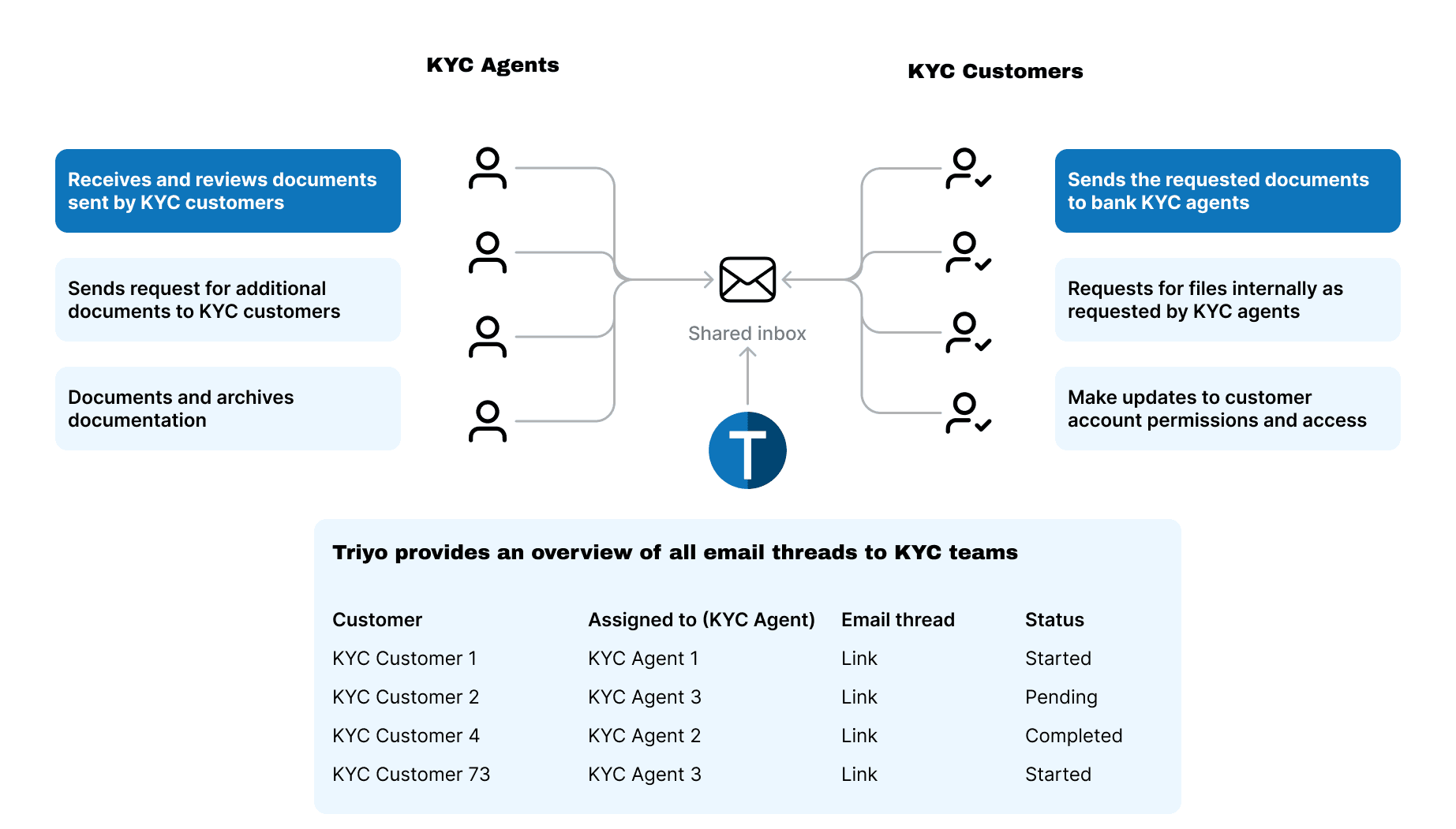
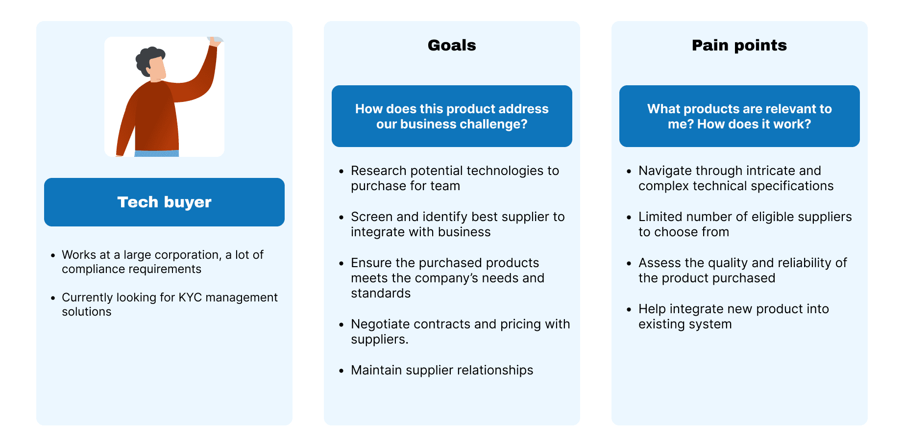
Triyo's product was designed to help track and manage the workflows of Know Your Customer (KYC) teams through an email tracking feature and a project management dashboard. The purpose of KYC is to verify and authenticate the identity of customers and assess the potential risks associated with establishing a business relationship with them. KYC regulations are to prevent laundering, terrorist financing, fraud, and other illegal activities.
KYC processes are currently handled by a team of agents who share an email inbox to communicate and collect documents from clients. Failure to complete this process has a lot of consequences for the client, such as the account restrictions or closure, refusal of bank service, and legal repercussions. It is important for KYC matters to be handled quickly and effectively from the bank side.
However, the Triyo site's user group are not KYC agents but the tech buyers that are in charge of discovering, investigating, and procuring new technologies to implement into their company. By discussing with subject matter experts and secondary research, I came up with a user profile of a tech buyer who is looking to understand how Triyo could help solve their problems.
Using Google Analytics and Hotjar insights, I was able to follow the journey of users as they navigated through our site. The site had a 80% bounce rate and users seldom visit other pages - much less exploring our use cases. However, while quantitative data tells us where and how many users are falling off, it fails to answer why are users dropping out? Is the content not engaging or is the UX of the site making it difficult to understand the content?

Because of the limited resources we were working with, a lot of my early research and problem validation was done informally and in my free time. I sought out 3 friends to browse the current Triyo website and answer questions about the product, such as "what is the product?", "what is it used for?" and "what features does it have?". 2 of them were unsure of their answer to what the product is, and all of them had trouble coming up with anything for the remaining 2 questions.
This alongside the data I had gathered, empowered me to put together a project proposal for revamping the current site and content so that it is easier to understand for users and the improve the clarity of the information provided.

Due to the limited resources available and the duration I was able to work on this, the revamp happened iteratively and key design milestones were set out for me to complete as a part of this revamp. The features were decided through a mix of UX research and business requirements
📖
🧭
💳
📦
In order to understand the current solutions and best practices, I completed a competitive analysis of alternative project management software on the market such as Monday, Wrike, and Asana. This provided us insight on how we should go about structuring and designing our site.

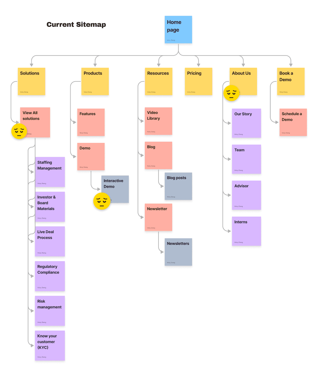
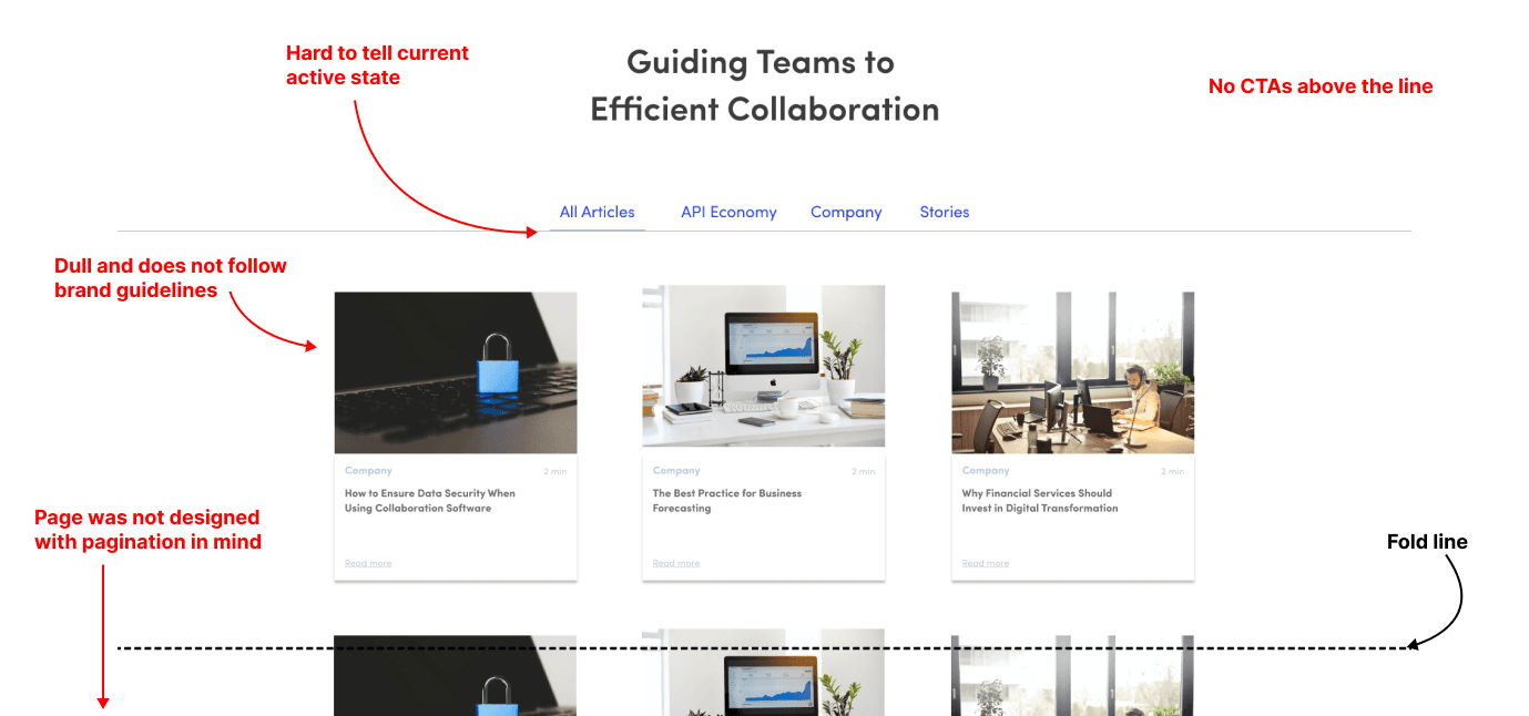
The current site information architecture makes exploring use cases very difficult. Decisive and engaging material, such as the use case demo, is hidden in secondary and tertiary pages. This results in users being unaware of potentially relevant information and not being able to further explore the product in a way that is more meaningful for them.
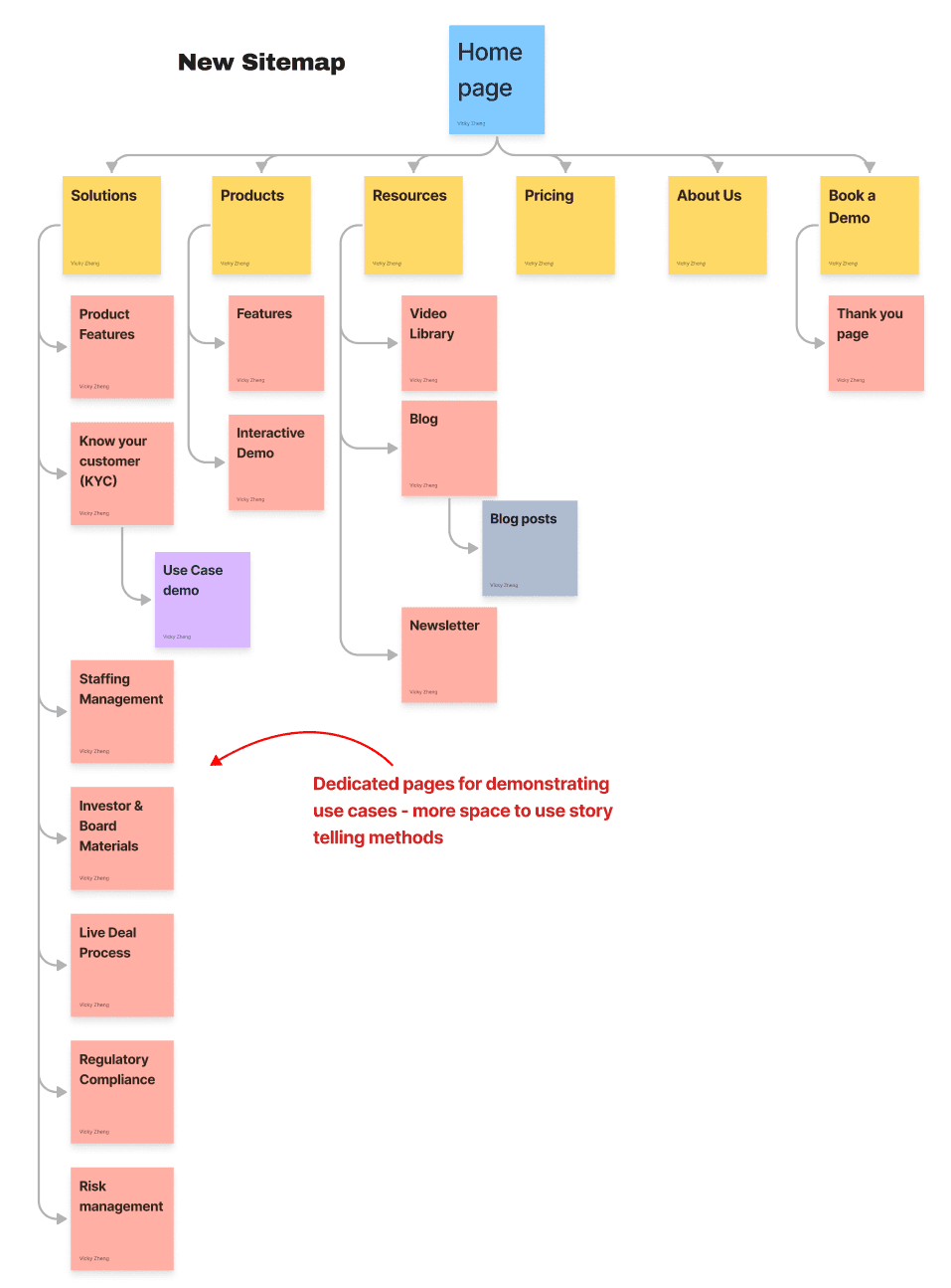
By researching web design best practices, I discovered UXBooth's resource on designing an optimal navigation experience. Following the recommended best practices, I was able to redesign the information architecture of the site.
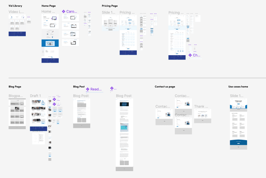
The revamped sitemap removed all of the inaccessible tertiary pages and moved them further up, ensuring no pages were more than 2 layers of navigation deep. Solutions were also given their own individual pages to accommodate a story-telling format on how Triyo's product solves the use cases. Impactful interactive elements, such as the demo, were moved onto the home page to be more accessible to users.
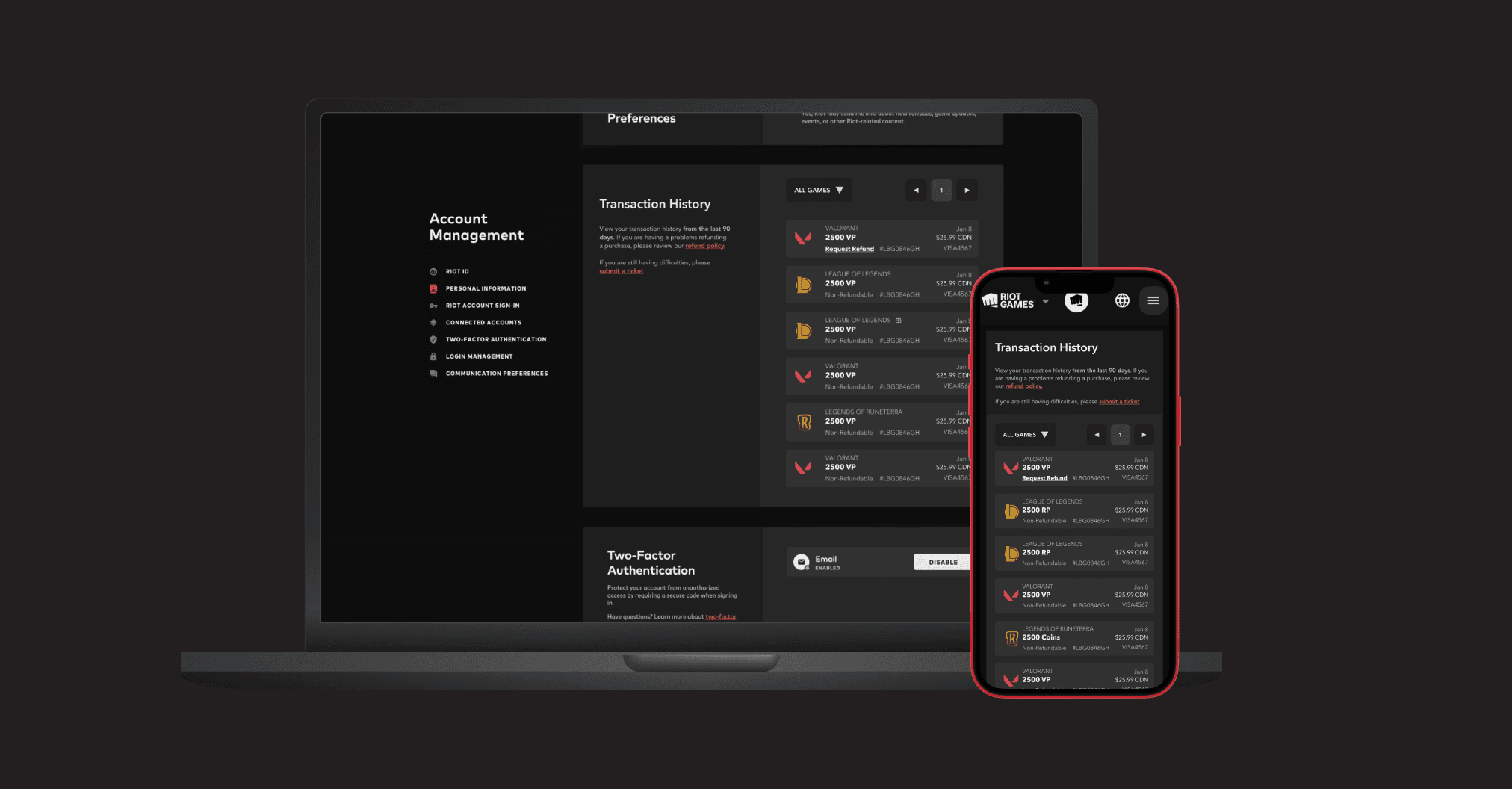
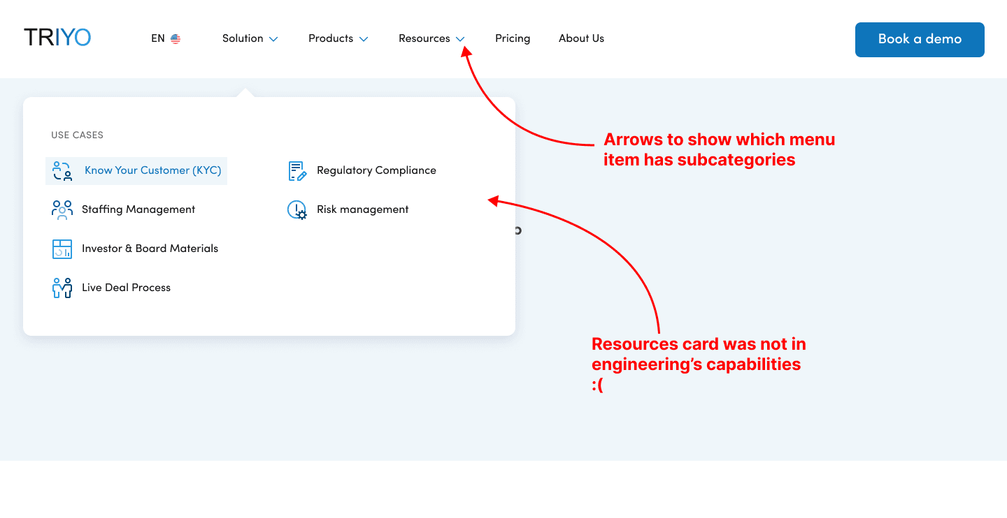
The first key deliverable I was expected to complete was redesigning the navbar to reflect the changes made to the site's information architecture. This included a rethinking of how we currently layout information and adding a resources card to provide more relevant content to the users. A mobile version was also crafted to address mobile users.
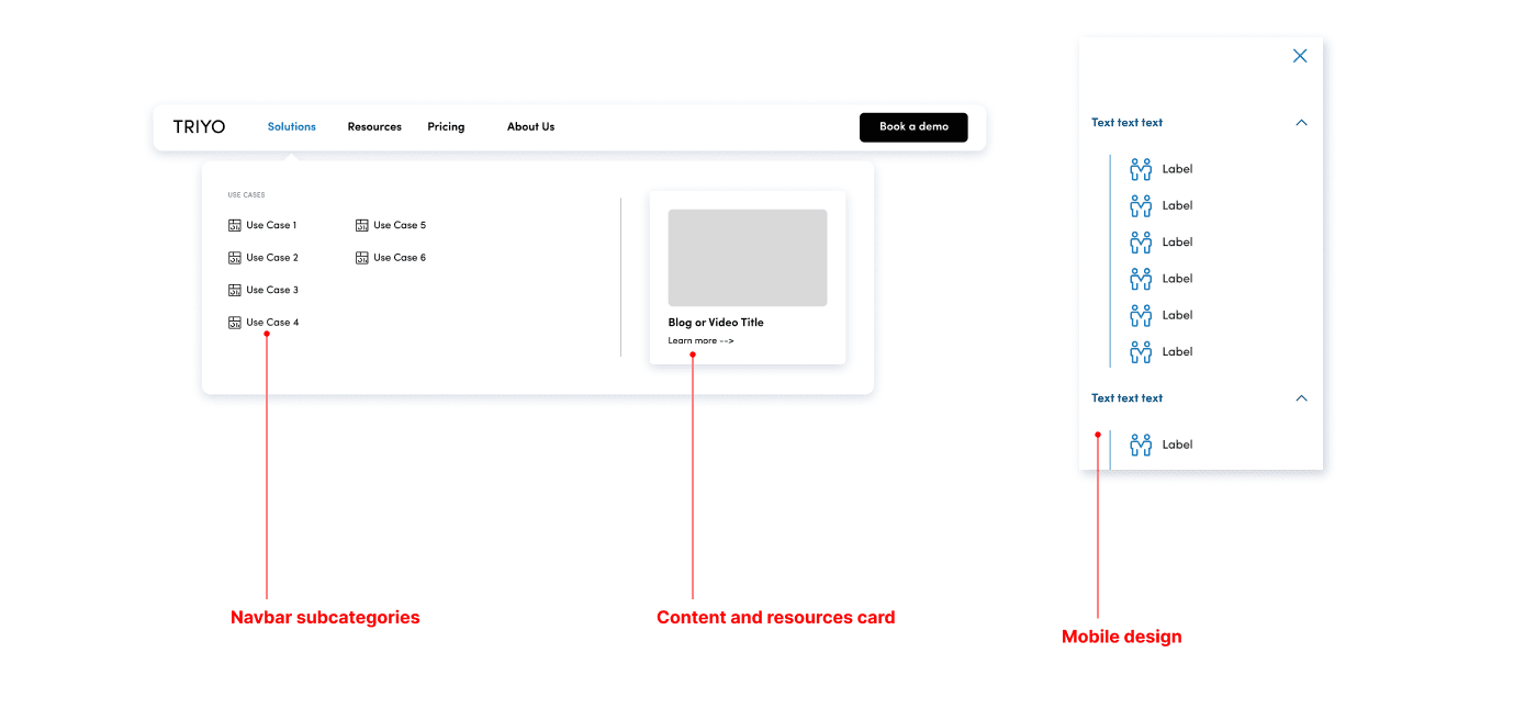
After discussing the design with engineering, we were able to further refine the design so that it would meet business requirements and engineering feasibility. By working alongside engineering and pivoting solutions when needed, we were able to ship the navbar within 2 weeks.
The last part of the puzzle involved what kinds of information should be included in the section's description. Using the competitive analysis as a starting point to investigate what sort of information is relevant to transaction histories, I was able to draft an early copy of what information and resources should be provided to users. This included instructions and links for users that are seeking a refund, users who do not recognize a purchase, and users who just want additional help.
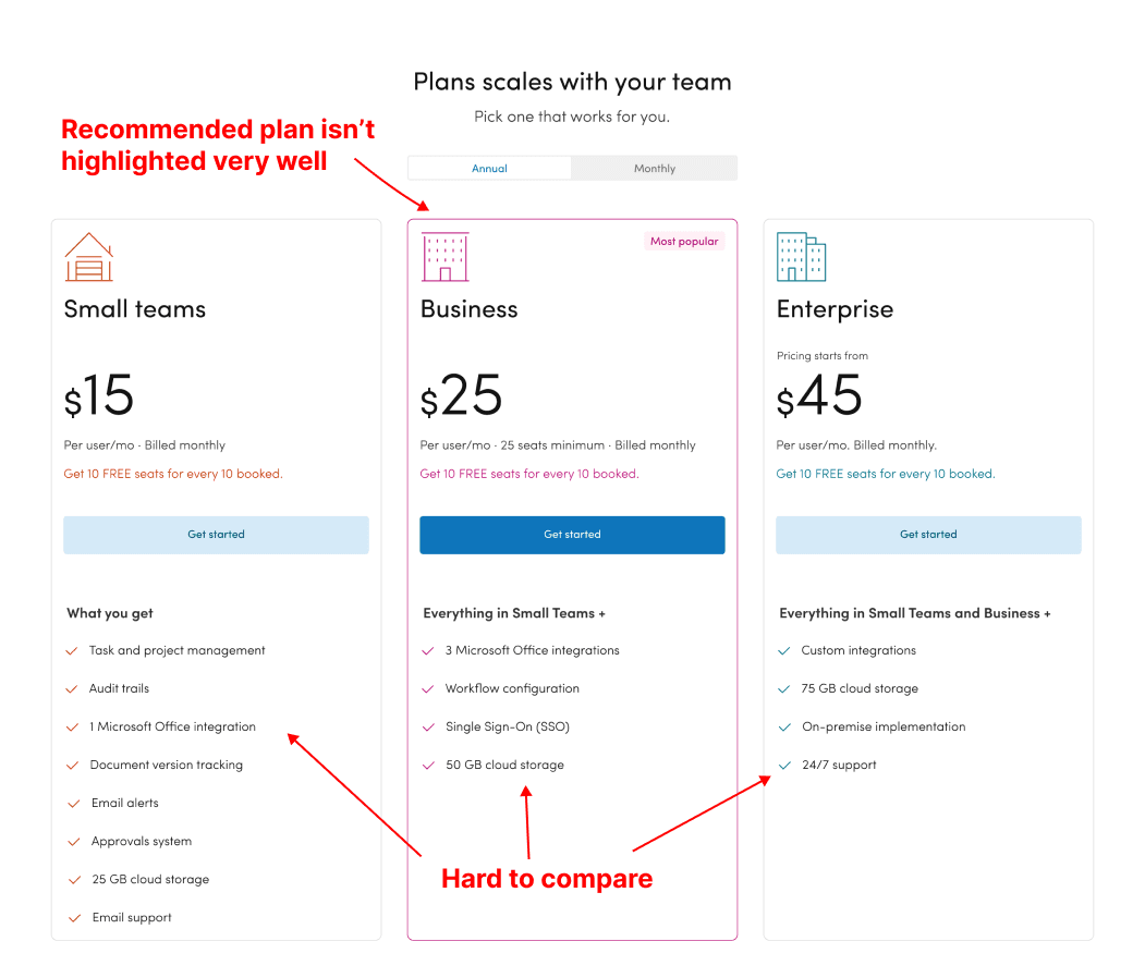
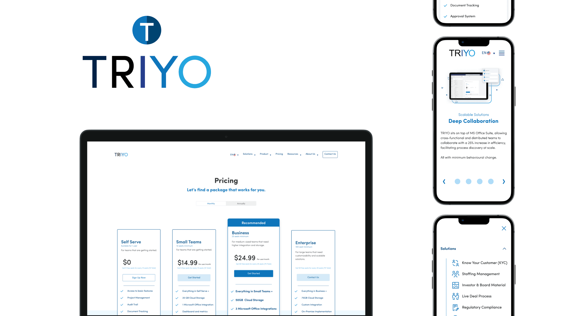
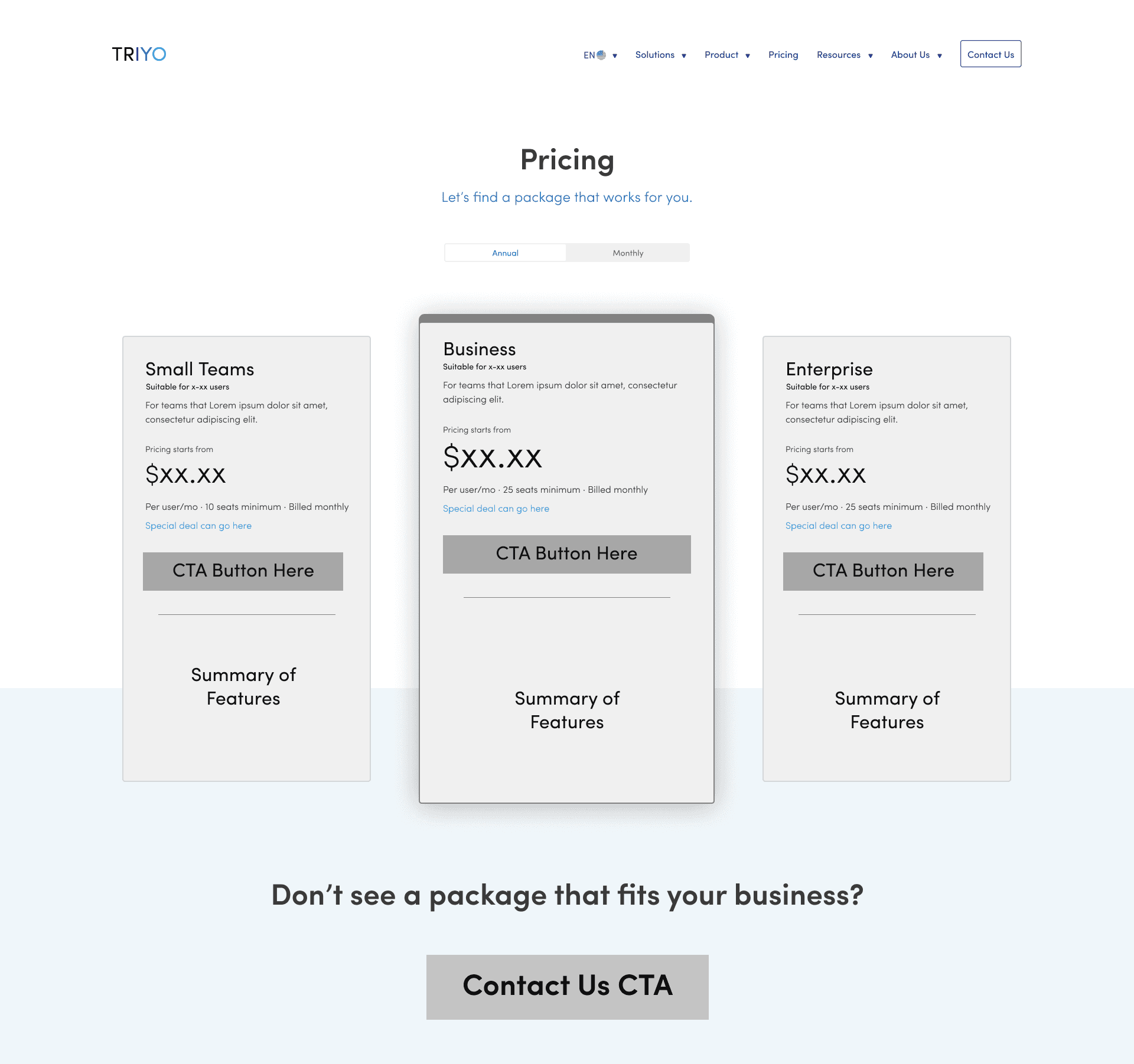
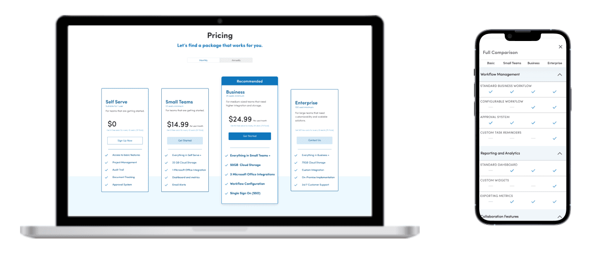
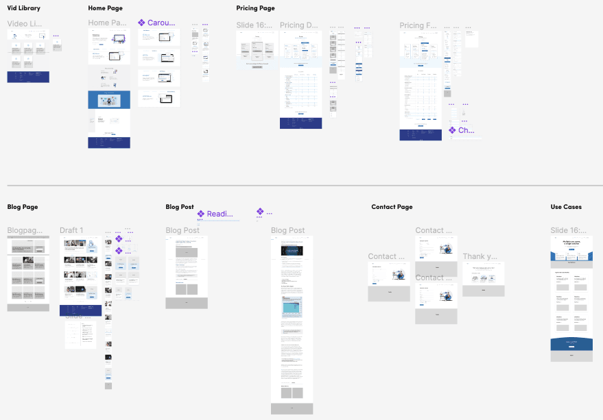
The existing pricing page fails to effectively use information hierarchy to push the recommended plan to users. By looking at how competitors and other businesses were designing their pages and helping users compare features between plans, I was able to craft a low-fidelity wireframe.
Below the top half of the pricing page, I wanted to include a comprehensive table detailing all the inclusion (or exclusion) of features within plans. However, this became a challenge when designing for the mobile version, where horizontal space was limited and resizing tables can get very tricky. To ideate solutions, I went and did more investigations into how competitors were able to solve this.
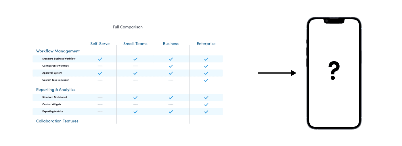
Through conducting competitive analysis and getting feedback and suggestions from other designers, I designed a mobile solution that enables users to quickly compare plan offerings on their desktop devices and phones.
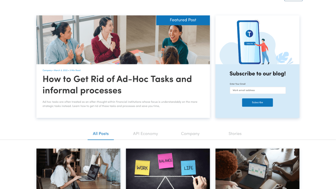
The next piece of my redesign was revamping the blog page to make its visual language more inline with the rest of the site. By discussing with the marketing team, I was able come up with a list of features and requirements that should be included in the redesign.
⭐️
📝
🏷️
🎨
The next piece of my redesign was revamping the blog page to make its visual language more inline with the rest of the site. By discussing with the marketing team, I was able come up with a list of features and requirements that should be included in the redesign.
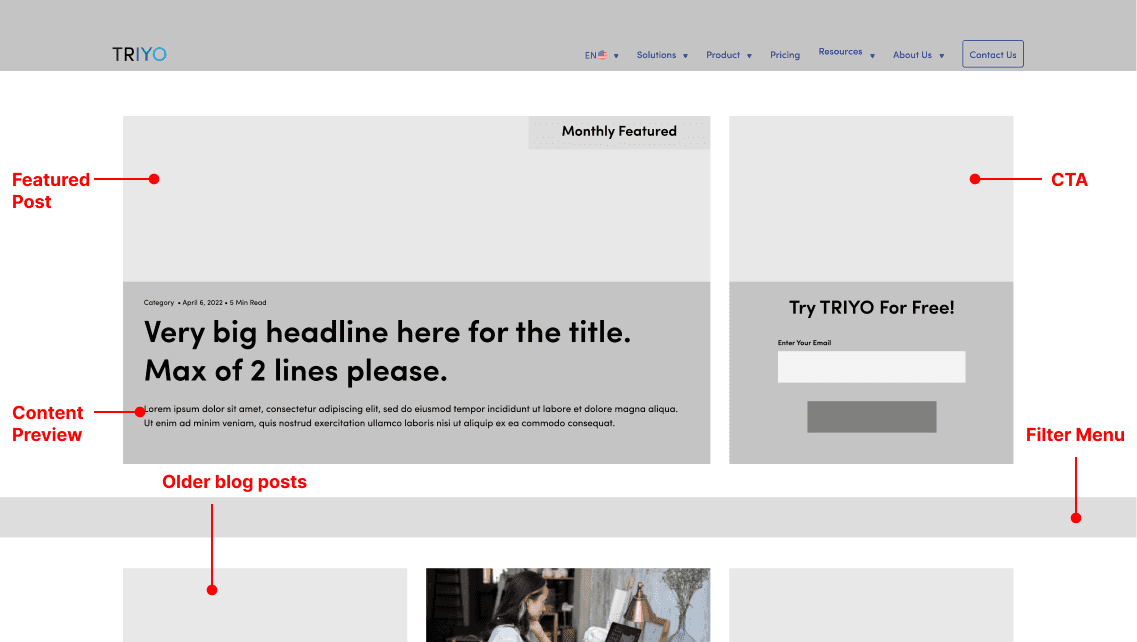
Working with marketing managers and product designers, I was able to bring the blog page into a higher fidelity version for engineers to develop.
In addition to creating the designs, I also had to create documentation for devs on edge case behaviours. Including this on the handoff allowed devs to understand the design patterns and removes ambiguity and the need to do guesswork in the development phase. I learned a lot by going through my designs with devs and hearing their questions and concerns, and I was able to use my background in computer science to communicate in a way that is intuitive for them.

In the 4 months I had to work on this revamp project, I was able to start on redesigning a lot of pages but unfortunately was not able to finish all of them. Major milestones, such as the navbar, blog page, and pricing page was able to ship. This being my first UX design internship, I am very proud of how much I was able to learn and accomplish within the short period of time.
Triyo was my first internship and it taught me a lot about the differences between design in academia and design in industry. Working with a group of diverse stakeholders and working around business requirements was definitely a challenge, and learning to understand and work with developers was pivotal to my development as a designer.
💻
👔
🗻
📊
While some of my projects went live, a lot of what I worked on never made it to production due to a variety of different factors. Because my redesigns focused a lot more on reworking and creating more content, there were not enough marketing resources to take the undertaking. Additionally, I was asked to update the site iteratively, which really limited how big of a change I could make at a time.
In the future, I definitely have a better idea of the resources, timelines, and scope I should include and negotiate for in future design project proposals.
Conclusion
Behind the scenes
⚙️
Figma & FigJam
Adobe CC, Google Suite
❤️
My mentor Theodore Chen
Marketing team associates Annette Le and Lesley Lai
Marketing developer Kevin Naranjo